Thursday, April 1, 2010
Closing Post
We've really enjoyed doing this project and we're glad that we were put in a group together.
We're happy with our final opening sequence and there's nothing that we really want to change about it.
This blog is now CLOSED
Wednesday, March 31, 2010
Screening Feedback (Target Audience)
We have had a succesfull screening!
We had a turnout of around 20 people ranging from the ages of 16-18.
By looking through all these questionnaires, i can summarise this.
We had a turnout of around 20 people ranging from the ages of 16-18.
By looking through all these questionnaires, i can summarise this.
- Our biggest drawback was the quality of our voice messages.
- The audience didn't fully understand the theme of the film, and found it confusing towards the end.
- They liked the titles.
- The soundtrack was seemed suitable and worked well with the sequence of events.
Screening Preparation
To get effective audience feedback, we composed a questionnaire asking our target audience what they thought of our opening sequence.
This is the questionnaire that we used:
http://www.scribd.com/doc/29222939/Questionnaire
Questionnaire
This is the questionnaire that we used:
http://www.scribd.com/doc/29222939/Questionnaire
Questionnaire
Thursday, March 18, 2010
Hooray !
After nearly three months of hard work, our opening sequence has been signed off.
We're really proud of the final sequence and feel that we made it to the best of our ability.
There were some ups and downs, as well as times where we felt the sequence wasn't coming together but thankfully, everything worked out !
:)
We're really proud of the final sequence and feel that we made it to the best of our ability.
There were some ups and downs, as well as times where we felt the sequence wasn't coming together but thankfully, everything worked out !
:)
Wednesday, March 17, 2010
Titles and fonts
We searched for different fonts that we could possibly use in our opening sequence for our titles
We used the website dafont to search for possible fonts
We used the website dafont to search for possible fonts
Thursday, March 11, 2010
Production Company name/logo
For the production company we tried to think of names that sounded like they would relate to the sector of the film industry that we were making films in; the thriller and horror film industry. We came up with a brainstorm of names:
We went through the same process for the distribution company name and thought of 'Black Rose Productions' which sounds like an independent films distributor that could specialise in horror films.
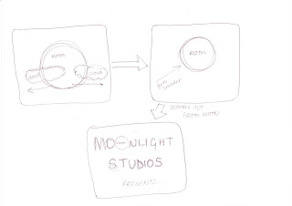
'Moonlight Studios' was the name that sounded the best, and was one that we felt could be most creative with to come up with a logo. Patricia and I both then worked to come up with some ideas for the logo, and had two initial ideas that we thought would be good. Here is Patricia's artwork:
When using the Mac the second idea was the one we could work closest to and we came up witha very good end logo to start the film off with, 'Moonlight Studios'...
We went through the same process for the distribution company name and thought of 'Black Rose Productions' which sounds like an independent films distributor that could specialise in horror films.
Monday, March 8, 2010
Editing of third shooting
After our last shoot, we have all the shots we need. However, we feel that something about the sequence doesn't flow.
After advice from our teacher, we have changed our sequence and removed several shots. We realised that it was weird for the character to sit back down on the stairs and drink wine when her friend is panicking on the phone. Therefore we had to remove that shot.
Luckily, we could fill a lot of spaces with our titles which meant we could remove shots that did not make sense.
By removing certain shots, we have increased the pace of the ending of our sequence which is exactly what we wanted. I feel that this builds up tension more and seems more realistic.
Subscribe to:
Posts (Atom)


